VIUP
VIUP is a work-in-progress V wrapper for the C-based cross-platform UI library,
IUP
Features
-
image
- load image
- convert image to native
- convert native to image
- basic controls
- containers
- dialogs
-
gl
- gl rendering
- gl controls
- scintilla
- plot
- extra controls
- clipboard
- browser
Setup
- Download the appropriate runtime libraries for your Operating system: https://sourceforge.net/projects/iup/files/3.30/
- If using image functions, download
IMruntime libraries: http://webserver2.tecgraf.puc-rio.br/im/
Windows install
Copy all applicable DLLs from Zip to binary directory. By default, only
iup.dll
iup_im.dll
IM
Windows App Manifest
Windows UI apps need to be built with a Manifest. This manifest includes details about the app such as the name, version, and characteristics. VIUP
includes a basic manifest with the gallery that can be easily modified. The generated
manifest.syso
To update the manifest:
cd winmanifest
windres -i resources.rc -o manifest.syso -O coff
Copy manifest.syso to application directory.
Note: Currently running
v .
v run .
.syso
#flag windows "path\\to\\file\\manifest.syso
Linux install
Extract runtime libraries to a folder and run
sudo ./install
Libraries Path
I've noticed in testing that the libraries are installed to
/usr/lib64
/usr/lib
Notes about dependencies
This repo comes with a copy of the headers for the version of IUP that it was developed against (3.30), but does not ship with the runtime libraries. It is
not
By default VIUP only initializes the subsystems that are imported. For example, importing just
viup
If an extension library is loaded (
viup.image
Example
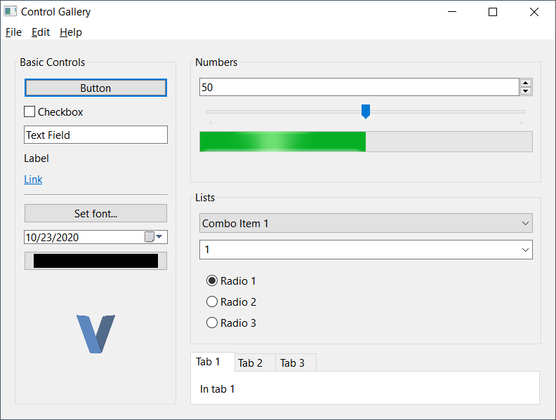
This repo comes with a simple application that demos all of the available controls. This app is available in the "examples/gallery". It requires the IM libraries. Once all runtime libraries are in the folder, run the example with
v run .
Using VIUP
One of the strengths of IUP is that is it a very simple library. All controls are instances of
&Control
set_attr
Here's a basic example of initializing a simple window:
viup.
    dialog(viup.scroll(hbox), "title=Control Gallery")   // Create our dialog with "Control Gallery" as the title and a scrollable Control
    .set_handle("MainWindow")                            // Define a global ID for our Window
    .set_menu("app_menu", menu)                          // Set an app menu if applicable
    .show_xy(viup.Pos.center, viup.Pos.center)           // Display dialog in center of screen
Autofree
VIUP should work with V's autofree, however, there are a few situations that can cause crashes. If a Control is accessed by calling
get_focused
get_handle
[manualfree]
free()
Attributes
All controls can be passed attributes as the last parameters when creating a Control. Any amount of attributes can provided. Attributes can adjust the various characteristics of a Control such as the title, value(s), background or foreground colors, control sub-type, sizing, etc.
Not all available attributes apply to each control. If an invalid attribute is provided it is actually accessible via
get_attr
Example:
viup.list(
    "List",               // control 'name'
    "1=Combo Item 1",     // Attr 1: Slot 1 is 'Combo Item 1'
    "2=Combo Item 2",     // Attr 2: Slot 2 is 'Combo Item 2'
    "3=Combo Item 3",     // ....
    "4=Combo Item 4",     // ....
    "dropdown=yes",       // Attr 5: List is a dropdown
    "expand=horizontal",  // Attr 6: Expand horizontally
    "value=1"             // Attr 7: Set default value to Slot 1
)
Callbacks & Events
All controls have callback methods available for various events. Each callback method starts with
on_
Example:
viup.button("Button", "action").on_action(button_clicked)

fn button_clicked(control &viup.Control) viup.FuncResult {
    viup.message("Button Click", "Button clicked!")
    return .cont
}
In the example above, a
Button
action
on_action(button_clicked)
button_clicked
ActionFunc
Func
The majority of callback functions can return a
viup.FuncResult
-
cont- continue action -
close- close the application -
default- perform default action (may be equivalent to contin most cases) -
ignore- ignores event and may stop propagation
Chaining
Most Control methods will return back the Control when finished. This makes it easy to chain several method calls together.
Example:
viup
    .message_dialog(
        "title=About",
        "value=$about",
        "dialogtype=information"
    )                                            // Create a message dialog with attributes "title", "value", and "dialogtype"
    .popup(viup.Pos.current, viup.Pos.current)   // Popup dialog to user
    .destroy()                                   // Destroy dialog when closed
Example 2:
viup
    .button("Set font...", "", "expand=horizontal") // Create button with "Set font..." as title
    .set_handle("font_btn")                         // Set a handle name
    .on_action(font_button_clicked) // Set a Action callback
Note: Dialogs return back an struct of
Dialog
popup
show
show_xy
Control
Controls
All dialog, layouts and elements are "Controls" in IUP. As such, they all share common methods that can be utilized by any Control.
Most used component methods:
| Method | Description |
|---|---|
get_attr
set_attr |
Get or set an attribute value on the control. |
set_attrs |
Used to set multiple attributes in a single call |
set_handle |
Assigns this control a name on the global level. This is typically used in combination with
viup.get_handle
|
get_font
set_font |
Get or set a
Font |
refresh
refresh_children |
Trigger a redraw for this component and/or its children |
Dialog Controls
| Function | Description |
|---|---|
color_dialog(...attrs) |
Opens a color picker with optional color palette |
dialog(child, attrs) |
Creates a standard Window or modal dialog |
file_dialog(...attrs) |
Open a file chooser. This can be used to open or save files |
font_dialog(...attrs) |
Opens a font picker |
message_dialog(...attrs) |
Opens a customizable message modal |
message(title, message) |
Shows a generic message box with a standard "OK" button to close |
Container Controls
| Function | Description |
|---|---|
background(child, attrs) |
A simple container element that is designed to have a background color or image |
detach_box(child, attrs) |
Container that is designed to be detachable from the parent container when needed. Can also be reattached. |
fill(...attrs) |
Fills the remaining space for the parent container |
flat_frame(child, attrs) |
Standard frame that allows custom rendering |
flat_scroll(child, attrs) |
Standard scroll that allows custom rendering |
frame(child, attrs) |
Container that puts a border around its children with an optional title |
grid(children, attrs) |
Multi-control container that lays out its children in a table-like design |
hbox(children, attrs) |
Multi-control container that lays out its children in a row |
menu(children, attrs) |
Multi-control container for a dialog's menu items |
radio_group(child, attrs) |
Container is used to group
toggle
|
tabs(children, attrs) |
Multi-control container for tabbed content |
vbox(children, attrs) |
Multi-control container that lays out its children in a column |
Standard Controls
| Function | Description |
|---|---|
animated_label(animation, attrs) |
Creates a control that can display an animation |
button(title, action, attrs) |
Creates a standard button with
title
|
canvas(action, attrs) |
A control that can be used to render custom content |
divider(...attrs) |
Draws a horizontal or vertical line (horizontal by default) |
label(title, attrs) |
A simple control to show text or images |
link(url, title, attrs) |
Similar to a label, can be used to link to an external source |
list(action, attrs) |
Creates a component that can be used to list multiple values |
menu_item(action, attrs) |
Used in the
menu
|
menu_sep(...attrs) |
Create a simple horizontal line in a
menu |
multiline(action, attrs) |
Creates a multiline chooser component |
progress(...attrs) |
Basic progressbar component |
slider(orientation, attrs) |
Creates a number-line slider component |
sub_menu(title, child, attrs) |
Creates a sub menu component. Sub-menues are children of
menu
|
text(action, attrs) |
Creates a standard text-input control. Can be set as multi-line, number input, etc. |
toggle(title, action, attrs) |
A radio or checkbox component. Defaults to radio when in a
radio_group
|
Contributing / Support
This project was developed as a way of improving my understanding of V & C. I will not be providing active support for the project, but I'll happily accept any pull requests. Use at your own discretion!
About
Author